Why Apple's store is worth studying
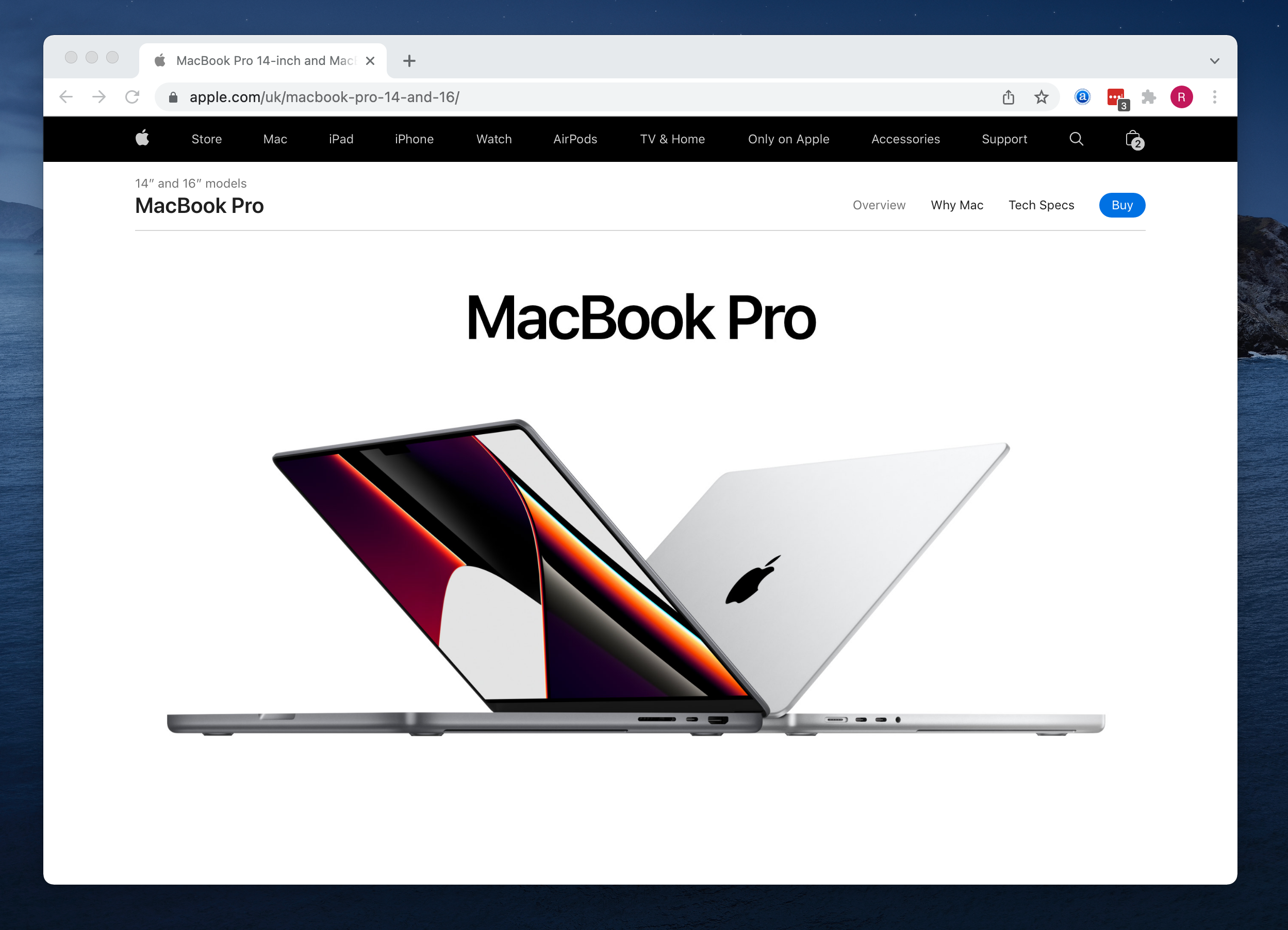
Apple.com does more ecommerce revenue than most countries' entire ecommerce market. Studying their buying experience isn't about copying Apple; most of what works for Apple works because you're already Apple. But there are specific design, copy, and UX decisions on their store that transfer to stores of any size, and a set that definitely don't. Knowing which is which saves you from the "we redesigned our store to look like Apple's and conversion dropped" problem.
This post is a walk-through of what Apple.com does unusually well, what's specific to their brand gravity, and the handful of patterns you can genuinely lift for a $50k/month ecommerce brand.
The product page: a masterclass
Open the iPhone product page. Scroll slowly. Notice what they do:
1. Hero without a hero carousel
The first thing you see is a large, clean product shot (or video) with a simple headline and price. No rotating slides, no competing messages, no pop-up newsletter signup. One product, one message, one price, one clear CTA.
Transferable: static hero, one message, one CTA. The "let me cram everything onto the first screen" instinct is what makes most ecommerce product pages worse.
Not transferable: the confidence to have "Starts from $799" above the fold with no discount, no time-limit pressure, no "save 20% today". Apple has brand permission to not discount. You probably need to earn it.
2. Progressive disclosure, not information overload
The page doesn't show every spec upfront. It shows the hero, then compelling imagery of the key benefit (camera, display, etc.), then progressively deeper technical detail as you scroll. The buyer-who-is-sold can buy from the top; the buyer-who-is-researching can drill down.
Transferable: structure your product page in layers. Casual buyer gets enough info above the fold to buy. Detailed buyer scrolls to learn more. Don't force the detailed buyer's info into the casual buyer's face.
3. Copy that's almost boastful but stays specific
"The most advanced iPhone yet." "A15 Bionic. Unbelievable speed." You'd expect that copy to feel hollow from most brands. It doesn't feel hollow from Apple because immediately after each claim is a specific supporting detail: benchmarks, specific features, concrete numbers.
Transferable: big-claim headlines need concrete proof within the same section. "Best running shoe yet" (bad). "Lightest running shoe we've ever made, 8.5oz" (same shape, actually convincing).
4. Selection interface as the star
The "choose your model" interface on Apple's product pages is remarkable. Big visual tiles for each option (colour, storage, model), with price updating live, clear highlighted state for what's selected. No dropdown menus buried in small text.
Transferable: variant selection deserves real visual weight. Most stores hide colour and size in tiny dropdowns. Apple's choose-your-colour interface is cleaner and converts better.
5. Trade-in prominence
On every iPhone product page, "trade in your current iPhone for credit" is prominently placed. Apple actively reduces the perceived price of a new purchase by surfacing the trade-in before checkout.
Transferable concept: surface payment flexibility (financing, buy-now-pay-later, trade-in) on the product page, not buried at checkout. Most stores hide Klarna / Affirm / Afterpay / trade-in options until step 3. Surface them earlier.
6. Honest comparison across models
The iPhone compare tool lets you put three models side-by-side with a full spec comparison. Apple helps you self-select, even if that means you end up choosing a cheaper model. This inverts most stores' instinct to hide downgrade options.
Transferable: give customers the comparison view. Hiding cheaper options makes buyers suspicious. Showing them builds trust and often sells the premium anyway (the customer talks themselves into it).
The checkout: fewer steps than you think
Apple's checkout is surprisingly streamlined given how complex the possible configurations are (storage + colour + protection plan + trade-in + financing + carrier + delivery):
1. Apple Pay prominence
Apple Pay / Apple Card financing is visually the primary payment option. For the 30-40% of visitors on Apple devices, that's one-tap checkout. Huge mobile conversion lift.
Transferable: Apple Pay + Google Pay + Stripe Link should be visually prominent at checkout, not buried below credit card fields. Shoprocket has these enabled via Stripe out of the box.
2. Address is one field, not ten
Type your address into a single field; it autocompletes from Apple Maps suggestions. Postcode, city, state are inferred. No "which format is this field expecting?" friction.
Transferable: use address autocomplete (Google Maps API, Apple Maps, Algolia Places). Reduces mobile checkout time by 30-50%. Most ecommerce platforms support this; most stores don't enable it.
3. Delivery selection is honest
Apple shows "delivered by Tuesday" with a specific date, not "5-7 business days". The specificity is a trust signal; vagueness implies they don't know.
Transferable: specific delivery dates at checkout convert better than ranges.
4. Apple Card financing surfaced
"Pay over 24 months with Apple Card" appears as a second payment option with clear per-month math. No "learn about financing" link buried somewhere.
Transferable: BNPL (Klarna, Afterpay, Affirm) is a conversion lift for orders above $50-100, especially for younger demographics. Surface it at checkout with the monthly-payment breakdown, not as a tiny footnote.
Post-purchase: the under-studied part
Apple's post-purchase experience is as polished as the pre-purchase:
1. The unboxing
Apple's packaging is famously designed. The box opens with intentional friction (just enough that opening feels like unveiling), the product sits precisely, accessories are laid out intentionally. Every element photographs well.
Transferable concept: packaging is marketing. An unboxing photo on Instagram is free acquisition. Invest in packaging for photogenic categories (apparel, home goods, beauty, tech accessories).
Not transferable: the budget for Apple-level packaging. Well-designed cardboard and a handwritten note get you 80% of the effect at 5% of the cost.
2. Order confirmation and shipping updates
Clear, design-consistent emails. Track-your-order link that opens a beautifully-designed tracking page on Apple's domain, not a third-party courier site.
Transferable: your order confirmation and tracking emails should feel like your brand, not a default transactional template. Shoprocket lets you customise these.
3. The setup flow
Apple's product comes with a setup flow that takes the customer through "how to get the most out of this". This pre-empts 80% of support questions and turns "I bought a phone" into "I'm using a phone effectively".
Transferable concept: include a "how to use / set up / get the most from this" email 2-3 days after delivery. Reduces support tickets and boosts NPS.
Things Apple does that you can't / shouldn't copy
1. The minimalist aesthetic on a non-luxury product
Apple's design is minimal because Apple is premium. If your product is a $30 impulse purchase in a commodity category, minimal design reads as "sparse and lacking" not "premium and confident". Context matters.
2. No social proof on product pages
Apple product pages don't have customer review blocks. They don't need them; the brand carries the trust. For any non-Apple brand, hiding reviews is a conversion mistake, not a design choice.
3. Pricing that doesn't flinch
Apple rarely discounts main product lines. Their discounts are structural (education pricing, carrier bundles, trade-in credits), not promotional. Small brands usually don't have the brand pricing power to never discount; expecting to "just not discount like Apple" without Apple's brand equity usually means lower conversions, not higher margins.
4. The one-SKU-per-product focus
Apple's catalogue is deliberately small. Their "hero" product pages get massive investment because there are so few of them. A store with 500 SKUs can't invest product-page-of-Apple quality into every page; pick your top 10-20 and do those properly.
5. The unified ecosystem story
"AirPods work with your iPhone, which works with your Watch, which works with your Mac." That cross-product synergy sells the next purchase. Most ecommerce catalogues don't have that interconnection; trying to force it where it doesn't exist reads as manufactured.
The five patterns that actually transfer
Distilling the above, the five things any ecommerce brand can genuinely lift from Apple's store:
- Static hero, one message, one CTA above the fold. No carousel, no popup, no competing asks
- Progressive disclosure of detail. Buyer-who-knows can buy immediately; buyer-who-researches scrolls to learn
- Visual variant selection (tiles, not dropdowns). Per-variant price updates live
- Specific delivery dates, not ranges, at cart and checkout
- Address autocomplete on the single checkout field
Implement those five on your top-revenue product pages and your conversion moves. Try to "redesign to look like Apple" broadly and you'll hit problems around brand gravity you can't fake.
What Shoprocket handles for Apple-style UX
- Cart drawer and mobile-native checkout (no full-page cart, no desktop form shrunk to mobile)
- Apple Pay + Google Pay + Stripe Link via Stripe integration
- Variant selection with per-variant pricing, images, SKUs, and stock
- Product video support in the gallery
- Clean product page template in the hosted storefront with customisable CSS
- Customisable order confirmation + shipping notification emails in your brand voice
- Structured data so your product pages earn rich SERP results
<!-- EXAMPLE ONLY. Grab your real snippet from Sales channels → Embeds in your dashboard -->
<script src="https://cdn.shoprocket.io/loader.js" data-pk="pk_yourkey"></script>
<div data-shoprocket="catalog" data-embed-id="emb_xxx"></div>
What Shoprocket doesn't replicate natively: Apple-quality address autocomplete out of the box (integrate Google Maps or Algolia Places); Apple-quality unboxing (that's you and your packaging designer); Apple-level brand gravity (that's years of work you can't buy).
Tip: Before borrowing any design pattern from Apple's store, ask: does this work for Apple because of the pattern itself, or because of Apple's brand gravity? The five patterns above work for any brand. The "no reviews, no discounts, no social proof" approach works only for brands with Apple-level trust already established.
TL;DR
- Static hero, one message, one CTA beats the three-slide carousel
- Progressive disclosure lets the casual and thorough buyer both succeed on the same page
- Visual variant selection converts better than dropdown menus
- Specific delivery dates (not ranges) at checkout
- Address autocomplete cuts mobile checkout time 30-50%
- Don't copy Apple's no-discount, no-reviews approach unless you have Apple's brand. Context matters more than the tactic
- Post-purchase polish matters. Custom-branded emails, clear tracking, "how to get the most" setup flows
Start a free trial and get Apple Pay + variant pricing + customisable emails out of the box. 14 days, no card.

Building ecommerce tools for independent sellers since 2013.